
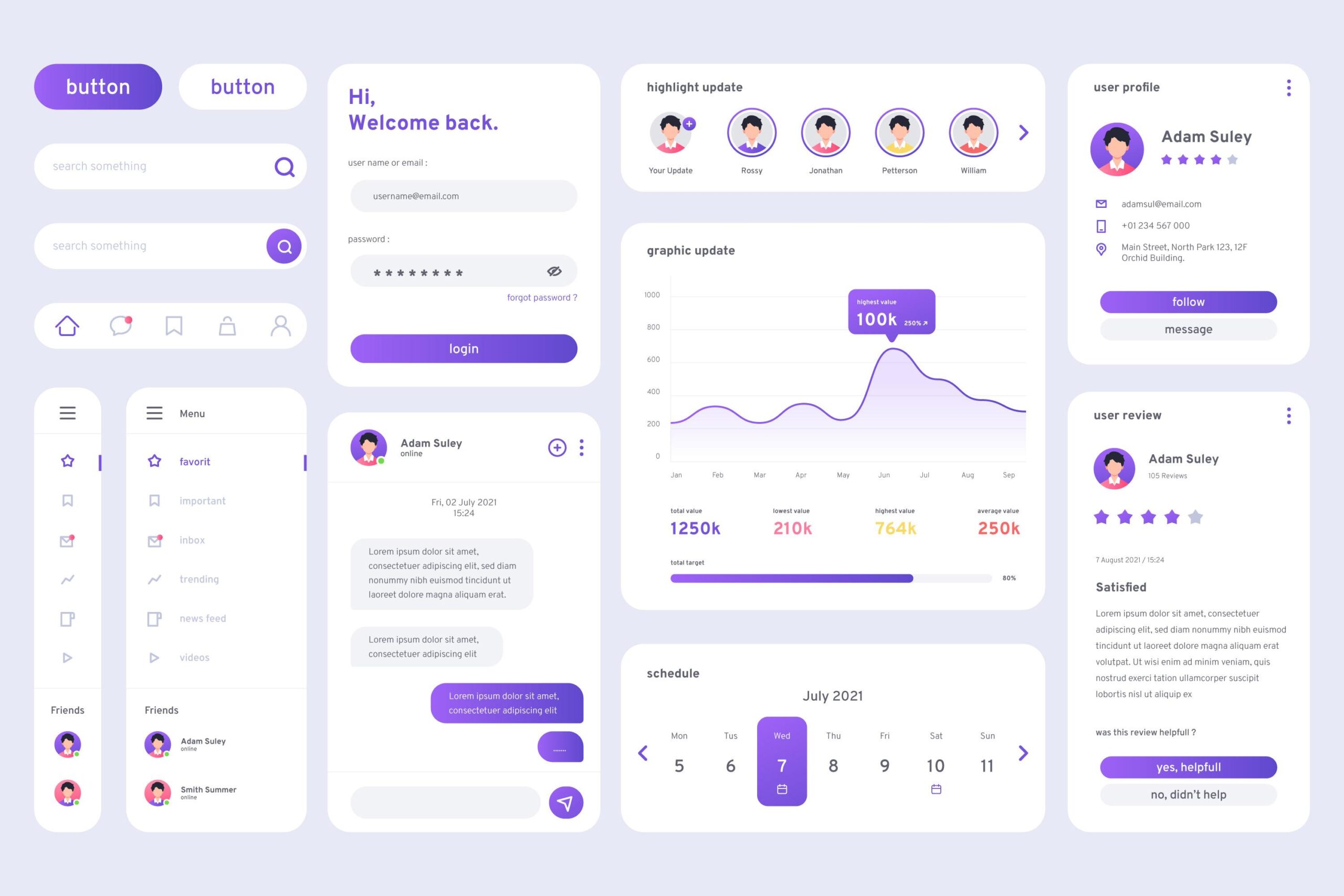
The ultimate goal of contemporary digital design is to establish intuitive and engaging user experiences. The User Interface (UI) components are the tools at the very heart of UI design. They are things the user sees and interacts with while navigating a product. UI components, ranging from buttons and menus to cards and modals, are responsible for governing the manner in which a user interacts with a digital interface.
Defining methods for constructing and implementing effective UI components permits an enhanced UX, alleviation of any degree of confusion, and elevation of user satisfaction.
What Are UI Components?
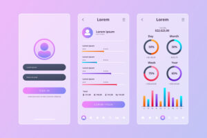
The basic building blocks of an interface are UI components. They comprise anything from buttons to sliders, input fields, navigation bars, to modals. On the one hand, they are visually appealing but on the other, they further a particular function that helps a user complete tasks in an efficient way while holding to brand integrity across products.In effect, they are the tools by which a user can communicate with your digital product.
Why UI Components Matter for UX Design
From a standpoint of user experience, UI components play a crucial role in helping users, provided these components are well designed. If these components are poorly designed, they frustrate and confuse, leading to abandonment.
Consistency in UI components leads to a consistent experience in the entire application. Hence, a familiar layout or button behavior gives the user confidence while navigating. Responsiveness, accessibility, and clarity constitute good UI design, and each one enhances the user experience.
To illustrate this, let’s look at how specific components influence UX:
| UI Component | UX Contribution |
| Buttons | Guides actions, confirms decisions, ensures clarity |
| Forms | Collects data with ease, reduces user effort |
| Navigation bars | Enhances discoverability, supports orientation |
| Modals/Popups | Offers contextual interaction, reduces clutter |
| Cards | Groups related content for easy scanning |
Best Practices for Designing Effective UI Components
Every piece of infrastructure you engineer should cooperate with a specific user goal. Whether it is to click on a button, fill a form, or navigate to another page, your components should seamlessly facilitate any such user actions.
To start with, know your users. Their needs, practices, and frustrations should be all input into designing UI elements with which your users can learn. Use familiar terminology from existing design systems, like Google Material Design or Apple’s Human Interface Guidelines, to increase speed and consistency.
Accessibility should also feature one of the main considerations. Components should be compliant with associated standards such as Web Content Accessibility Guidelines (WCAG) to ensure use by persons with disability. This includes having suitable contrast ratios, keyboard navigability, and screen-reader support.
Finally, test your components in the real environment. Observe users using them and be open to changes. The best UI designs are born in a never-ending process of learning and improvement.
Conclusion
With the evolution of technology, the methods of the consumer in interacting with digital products have also changed. Microinteractions, voice interfaces, and adaptive design are now becoming the norm. UI components will need to respond to these trends and still maintain the basic principles of usability and clarity.
Customizable components and modular design systems will gain more momentum in the future, enabling teams to scale while preserving a great user experience. The line between design and development will further blur, so the collaboration of both will become more and more critical.
FAQs
What are the UI and UX distinctions?
UI is the visual component that the participant interacts with, e.g., buttons and menus, while UX is the sum of all experiences that a user has with the product: how intuitive and enjoyable it is.
Why are UI components important in designing for web and apps?
These components maintain consistency, increase usability, and save development time by providing reusable, functional blocks with which users can interact.
How can I create a user interface component that is more accessible?
Make use of high contrast; include keyboard navigation; clearly label elements; and test your interface with screen readers to meet accessibility standards.
Do I need a design system to make good UI components?
While not necessary, having a design system would help to ensure consistency, enhance collaboration, and facilitate the design and development process.
What tools are best for designing UI components?
Figma, Adobe XD, and Sketch are popular tools, together with tools integrated into frameworks for a development-ready component library such as React or Vue.